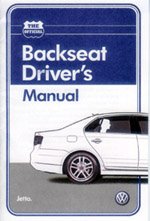
Volkswagen - Word of Mouth value from a very smart print execution - Backseat Driver's Manual

I opened up the July edition of Wired and glued in the middle was a little booklet (well not really that little at 13 pages). I almost dismissed it but it was too big to ignore, which I’m sure was part of the plan. This far from ordinary booklet was titled “Backseat Driver’s Manual” from Volkswagen Jetta.
It addresses such pivotal items as “Radio Station Selection”, “Car to Car Communication”, “Food Distribution”, “Venting of the Rear Cabin” and “Monitoring Fluid Intake” i.e. so unnecessary bathroom breaks are avoided.
I think this is one brilliant print piece in a world where print is arguably lesser and lesser of an engaging medium.
Here’s why:
- It looks like a real manual, authentically poking fun at themselves
- It is based on the realities of annoying passengers and is rather funny
- It contains an “Official Backseat Driver” card you can remove and affix a picture.
- The card is sans logo and/or mention of VW or Jetta brand
But wait, there is no logo? No mention of VW or the Jetta brand on the part you remove and can keep or giveaway? Yes, exactly. They have gotten over themselves. That is where I believe they did the job even better. By managing to avoid slapping themselves all over it really maintains the integrity of the piece as a joke. It has greater pass along value and WOM – word of mouth potential as a result.
I have to assume the clients at Volkswagen are thrilled with the stellar creative ideas from their agency, Crispin Porter + Bogusky . These are the same client folks who allowed their product to be smashed with people inside; a gutsy move many clients would have never even though about takin to air.
What could have made this better? Well, there does not seem to be any online component. I did a search and did not come up with much. Thanks to the folks at EMP for the jpg of the booklet I found on their site.
This is just smart. I like.

2 Comments:
Wouldn't this make a fun several part video podcast? I can totally see it. VW, if you are reading let's talk!
I got this as well and the first thing I did was rip it out and throw it away during my "de-ribbing" of the magazine which is where I always go through and rip out all the stuff that get in the way. I gave it a quick glance and actually thought it was a Mini ad since they've been doing a lot of this and then it got thrown in the garbage.
Seems like a lot of money for very little effect. Especially to put it in Wired where you know the audience is a plugged in one. Great idea, but I'm not fond of the execution.
C.C.
Thanks for the comment. I too begin my magazine ritual by ripp'n and chuck'n the inserts.
Any print campaign that interrupts that routine and makes me do a little "double-take" has done it's job in my mind.
I'm still not understaning how/why the digital integration opportunity was missed. It is unlikely it was an oversight.
Carrying the offline momentum to online would have resulted in a more effective spend from print.
Keep up all your great work C.C. , I'm loving Managing The Gray!
Post a Comment
<< Home